Showing posts with label painting. Show all posts

Thursday, May 27, 2010

End of Year 2 (a month later!)

So I took a little break from this after the end-of-year madness. Class ended over a month ago and I was hunting for a summer job (last time I'll have to do that though! Yay co-op next summer!). Decided to finally put a few things up from the last projects, as well as a few extra art-type works I got my hands into after school ended.
Starting off with the final painting assignment:
This used line-work from a pan-background layout assignment we did, which I never put up, which included a character walking across it from our walk-run animation, which I also never put up here...
Moving on! Final storyboard assignment used our 4 characters from that big character design project, which I DID put up, and put them into a TV-style storyboard sequence. We had to plan out a 3 sequence story and then choose 1 of those sequences to board. Then we had to observe carefully the ins and outs of TV storyboarding. I'll find out exactly how I did on this project when I pick it up in September, but I did well in the class so I'm guessing I did well with this.
Don't think you've seen the last of the trains! Having this sequence occur on a moving train, and viewed through various camera angles makes the sequence quite special layout-wise. And what do you know, I used part of it for my final layout assignment, which I'll post up if I ever get around to fixing 1 or 2 things with it.
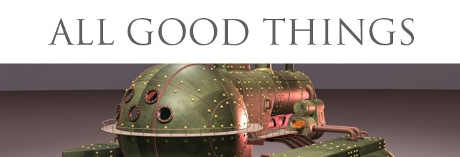
Finally, away from assignments, here's some paintings I've done for my own enjoyment. The first one here I started back in August of 09, most of the work was done then but I finally got around to finishing the thing after class ended. Also, if it looks similar to the image at the top of this blog, that's because the top image is a previous version, one with a more cartoony rendering style. For this painting I wanted a lot more realism:
This next painting had similar motives, improving my realistic-rendering skills. I wanted to try my hands on something complex and metallic, so I choose Samus Aran from Nintendo's Metroid Prime series. I was also inspired by watching some people doing a playthrough of Metroid Prime, I would start replaying the game myself, but I've got loads of art stuff I'm trying to do right now, plus work, plus I probably enjoy painting more than playing anyways. Or rather, painting is a sort of playing for me, sometimes, which I'm sure is a very good thing.
The blue stuff is a crazy radioactive substance called Phazon. Samus is firing her Plasma beam, which is the strongest in the game, and since the sun is made of plasma I figured I'd make the visible innards of the gun resemble the solar surface, whereas in the actual game it looks more like lava. Also at first I didn't want the gun to be firing, but rather show the inside of the barrel glowing. But then I felt the void around the gun needed something more compositionally-speaking, so I went ahead and added a big fancy beam blast.
Well this post is more than big enough, as I said I have lots more art stuff in the works, so if all goes well there should be more pictures for you guys and gals to glance at soon!

Saturday, December 12, 2009

Not the clown this time

Though this almost became another Easter Island thing, but last minute inspiriration changed that. Final painting assignment for this semester, in fact this may be the last traditional painting I will have to do for a long time, since next semester we start the digital painting course. Interesting enough that will be my first dedicated digital painting course.
Technically this was also supposed to be related to our final storyboard. The assignement sheet says it was to be a full background based on one of the layouts, based on the boards. However somewhere the schedule went all screwy so our teacher said we could basically do whatever we want, as long as it's not digital. I figured I'd at least somewhat conform to the intial plan, so this painting is based on the volcano eruption from my Easter Island boards, though this really wouldn't work as a background, since that cloud should be animated, meh. Also considered putting the Easter Island statues in, but then I remembered my semi-promise to myself to avoid Easter Island stuff. Anyways I felt what I had painted was good enough:

This was done in "acryla-gouache", the impossibly wonderful marriage of gouache paint and acrylic paint, so it can go down transparent like gouache but when it dries it's like acrylic in that it doesn't ever lift off again. Used this for all my other paintings (which you haven't seen, working at that) this semester and I'm really starting to like it. I'm feeling almost more comfy with it than with digital, mainly after an experimental painting during class.
And here's some digital stuff I did to get my brain flowing for the final. I was planning on painting the Easter Island one as the final but changed my mind this morning for reasons mentioned earlier:
Also I still didn't feel the contrast and composition were working right for this one.
I liked the water here but felt this was too far away and way to central in compostion. Also, if this is reminding you of the final paintings from this time last year it's no accident, I was in the mood for rehashing the idea.
This is me ripping off Homeworld on purpose. Close, still not quite right though. Hopefully I'll pick up a new brush technique or two in digital painting class proper. I can make things work but my digital stuff still feels a little more 'hazy' than I intend. I figure I need to be braver with more saturation and changing colours or something. Figure it out eventually. Till next time!

Monday, September 28, 2009

Scary rocks 2

Continuing the painting assignment, I've put together some digital color roughs (still have to paint more the old fashioned way, but this helps me visualize quickly):

If I wanted to fiddle more with these I'd make the sky brighter in the 2 monochromatic ones, which are literally the multi-color painting desaturated, then with a few mouse clicks set so the achromatic lights and darks translate into the lights and darks in monochromatic. No re-painting was done, as I said just trying to quickly visualize, since I need to repaint by hand anyways, why waste time?
I do quite like the multi-color and I'm hoping the final will mostly be an improvement on that. Also after a demo in last weeks class I'm considering switching back to acrylic, only this time using a transparent method. I've always painted super-opaque with acrylic, but transparent-style painting with the layering ability of acrylic (as opposed to gouache which often gets messed up when you paint over it again) is tickling my curiosity...

EDIT: Re-uploaded the monochromatics with new versions where I fiddled with the brightness/contrast setting to get rid of the murkiness.

Thursday, September 17, 2009

Scary rocks

So STILL not done that digital painting I've been going on about, but I do have this line work for the first actual painting assignment this year!
Really happy already with this, the rocks were originally going to be more jagged, crumbly and pointy but inspiration switched me towards the big precarious boulders like you see in the deserts and canyons in the US. One things for sure, that temple in the center would not be a safe place to be!
At the same time I'm about to start up my Wave-Boat-Sac animation, and the first phase of storyboarding project 1 might get up soon as well. Depends actually, I'm getting an urge to finish up that digital thingy and I might just fall on that. Tune in next time to find out!

Wednesday, April 22, 2009

10 points for saying Precarious

Almost the end! Just one test and one digital animation to do! The animation will take all of a half hour, I'll see what other stuff from our Digital class I want to put up once I grab everything off the school network on Friday (cause they wipe everything after the end of the year).
Meantime, here's my last 2 painting projects! First up is the second half of the second-last project, the interior, you know the one 'based' on that copy of a painting I put up earlier. It's Dr. Jekyll's office/lab:
Finally, the final painting! We had to take our latest (also last) character from character design and put it in an environment. My character was a construction worker doggy, so I put him having lunch on a skyscraper. I was gonna have the skyscraper look a lot less finished, but time constraints said otherwise. That way his presence at the end of the seemingly random steel bar would make a bit more sense. Also, trying not to blatantly rip off Mirror's Edge here, but I really like that crisp blue skyscraper-cityscape.
Stay tuned, more final project uploads to come!

Monday, April 6, 2009

Interior Painting 1

I know, lack of posts for like a month and then BAM!

Anyways, working on our last major painting assignement. We have to paint a room interior based on a description given in a selection of book excerpts which we were provided. I chose the Jekyll and Hyde excerpt, but that's actually not the painting you'll be seeing in this post...

Cause the other part of the assignment was to find an artist whose style we wanted to emulate in some way and make a copy painting of one of their works. I really didn't have any specific artist in mind, to be honest I wouldn't be able to pin down one specific artist who drives me, but I certainly know a piece I want to emulate when I see one.

But again, I also need to find something that first off, wasn't going to be impossibly hard and secondly had close-to the same mood as the interior painting, which will be of Jekyll/Hyde's gloomy laboratory.

So I browsed around and found a piece I liked by Lou Romano, who works for Pixar, doing the voice of Alfredo in Ratatouille and is apparently the Art director for the upcoming 'Up!' (ignore the pun, it was unavoidable). I got the image from his blog here: http://louromano.blogspot.com/2007_08_01_archive.html

My version:

I used only gouache, he used acrylic and gouache. His was 11 3/4" x 23" in size where as mine is 5 3/4" x 11". Just FYI.

Next post will (hopefully) be my finished interior.

Thursday, April 2, 2009

Still Life March 09

Just got this back , we had to do a still life painting involving a reflective object and a transparent one and some cloth/drapery, handed it in right after reading week (yeah we get paintings back kinda slow). It was nice to go back to good ol' observation paintings, used gouache to get some more practice with the medium.
I'll have the finished polar bear walk up tomorrow (well that's the plan), for now, onto charachter design!

Sunday, February 15, 2009

Day/Night Painting 3

Got this done last week, but epic amounts of work have prevented me from posting the finished digital version of the Day/Night paintings. I'll put up the real paintings in this post once I get them back.

Saturday, February 7, 2009

Day/Night Painting 2

Well the painting project is getting quite complex, but here goes:

Made a new 'rough' (gosh how I wish I could just make it rough!) for the day scene, same in concept but quite different in colour and composition. Well it has sort of the same palette, but it's brighter overall. The line-work on the ship in the foreground won't be in the actual painting, at least that's the current plan...

Just an FYI, the ship in foreground is roughly battleship sized. The ships in the background... well as you can see there's nebulas crossing in front of two of them. Nebulas with stars (those little specks of white, hopefully that was obvious enough) in them. Yes, the background ships dwarf the stars that lay between the ships and the viewer. Think I'll communicate that better by making a few larger, more noticeable stars (note to self, vary the star colours too), but they'll still just be points of light. Anyways, I like how this new composition works, even if the ships don't really look quite as big as intended, they look bigger than they did in the last rough, partially due to atmospheric perspective as well as the smaller size and positioning of the foreground ship.
I've also started the rough for the night scene, it's not even half finished, but it has the basic elements, which may or may not change. Hoping to not go nutz with detail and have a finished rough before I go to bed, then I can spend all day tomorrow painting the two of them.
For at least part of this project we're supposed to put down an underlayer of acrylic paint, the colour should be complimentary to the colour we are going to put on top of it. Because the night scene will have much stronger colour contrasts, I decided to use this technique on this one. Even though the rough isn't finished, I know it will have this composition and basic colour layout, so I've already put down the acrylic underlay, so I won't have to worry about it being dry or not later. I simulated this in photoshop, the rough you see actually has a layer of red under the green part, and green under the red. Not as important in photoshop where there is no texture to the painting surface, and colour transparency+mixing is mathematically precise, but I figured it was a good idea to simulate the technique anyways.
Lots of work ahead still, not just on this but in every other class as well. Don't turn that knob! (oh, that is almost out of context in this day and age)

Wednesday, January 28, 2009

Day/Night Painting 1

Made a needlessly detailed rough for the Day/Night painting assignement. Planning to make two small paintings rather than one big one that's divided in half like some sort of chimeric-doppleganger, as cool as that is, and sounds. Simple idea, a 'sunny' nebula with a REALLY honkin big starship set in front of it for the day painting. For the night painting the nebula will retain the basic shape but the color scheme will be much more, well, night-like. There will be stronger contrasting colours, lots more darks, and the spaceship will be a wreck.
like how the nebula turned out here, and the spaceship is okay, I just don't feel that it looks quite big enough still, I had in mind a ship that would be larger than a planet (but not shaped like a planet cause that would be to close to Death-Star-wannabees). If you ever played Homeworld 2, and took a look at the massive wrecks in the background, wrecks that dwarf your mothership by several orders of magnitude, you'd know what I'm after. At the same time I can't just copy Homeworld's methods exactly for convincing us that something is really ridiculously big, so there's quite some challenge here. Anyways, here's what I put together in Photoshop:
Yep, it's a communist starship. Just because. Maybe it's got something to do with getting Red Alert 3 over the holidays. No the night scene is not some allegory for the fall of the Soviet Union, I just felt it would be lame for the starship to be exactly the same (aside from lighting) in both scenes. Yes, I have no idea how I'm going to paint this with gouache, should be interesting to say the least!

Tuesday, December 9, 2008

Duelling Paintings Part 1

Final assignment for this year, everything else is handed in already, all tests are complete etc., so this is all I have to work on now.
Final painting assignment for this semester is two paintings, one the opposite of the other, in whichever way you care to interpret the meaning of 'opposite'. For mine the 1st painting is a tranquil ocean scene (well the waves are rather choppy but it's still cheerful). In the 2nd I will replace the water, with lava, and that happy dormant volcano will become a raging fireball-like lava dome surrounded by the shattered remnants of the mountain's sides.
Like the previous painting (get that back soon hopefully) I'm making the rouhgs in photoshop, from which I'll paint the finals. Making the rough for the 2nd at the moment, I hope to finish that and get some progress on the finals before tomorrow.
EDIT: Finished the rough (a very detailed rough, too much fun!) for the 2nd painting as well. The 1st might be a wrecked civilization amongst crashing waves, but compared to the 2nd painting, ANYTHING else would look like paradise. Observe:

Tuesday, November 18, 2008

Landscape Painting Part 1

Well I did the painting, but in the wrong medium. No, I didn't use the wrong paints, I mean completely the wrong medium, as in it is on the computer, not paper.
No it wasn't a mistake. I did this for my final cloud painting too, I make the whole thing digitally, because Photoshop is nigh-infinitely forgiving if you know what you're doing (which I do, w00t) then print it off and use that as a basis for the traditional painting I'll actually hand in. Basically I end up with two different finished works. The digital one SHOULD be less 'finished' than the physical one, but I often get carried away, so whether or not this approach adds or detracts from my final is yet to be discovered. I did two studies traditionally before, so the switch in medium shouldn't be too startling. Anyways, I'll be doing the real one tomorrow, for now you can see my digital study. Which I might add, you'll get to fully see, where as the finished 'real' painting won't entirely fit in the scanner.
They need to start selling bigger scanners to the masses...
If I can make something that looks like this in gouache, I will be very happy. If it looks better I might be ecstatic : D

Thursday, November 6, 2008

It's like having the movie Dune in your drink.

So in painting today we ironically didn't touch the paints, but did landscape studies using graphite powder in preparation for our landscape paintings due in a few weeks. Combining a few reference pictures I came up with this:

I'll be making some colour studies based on this using photoshop and eventually in real paint (remember that stuff?). It's a sand desert, though as it is it wouldn't be hard to convert to an ice desert. But as the title for this post suggests, I'm headed for the hotter variant. The scene is supposed to have a man-made object in the foreground, I'm thinking either adding a wrecked plane, oil well, generic hut or just rip off a Wind Trap from the Dune series (link is NOT my work). Anyways this exercise was great fun and I'm much more confident about painting dunes now.

Thursday, October 23, 2008

Paintings that worked!

Today I was working on my Cloud Painting assignment. I still have to do the final painting for that, but half the project is the studies before that, which are now done. Lessons were learned once again this painting session, but nothing as drastic as 'bought wrong paints' went wrong this time. Some of the paintings turned out better than others, but I'll be using them all anyways, since he's not expecting the studies to be masterpieces:
Just an FYI, these are about the same size as you see them here, as in if you click the image to enlarge it what you'd see would be larger-than-life.
Things that would be changed: The one with in the desert, those yellow lines on the road were a late addition I wish I'd left out. Also, I think these have to be analogous, so that yellow sand is too different a hue. The one with the wispy clouds over the ocean (not the billowy-clouds-over-ocean), the clouds need to stand out more. Though that may be difficult to achieve. I did that one by painting a plain blue sky then adding the wisps with white paint, whereas the usual method is to leave the spaces that are to be white unpainted (which I did with every other painting). But with wispy clouds this is quite tricky, I'd basically have to paint the sky in between each wisp. And the night scene with the full moon is a little bland...
The aforementioned billowy-clouds-over-ocean might be my favourite. I feel comfy with the orange sunset but I'd probably rearrange the cloud formation. I like the crescent-moon scene too, though as-is it's pretty much the billowy-clouds-over-ocean, just with purple.
For tomorrow, the room drawing! REALLY hope I can finish it all tomorrow, but I do have Saturday to work on it as well. Wish me luck!

Tuesday, October 7, 2008

Lessons learned: Painting

Tonight I started work on my 2nd assignment for Painting, Rendering a Sphere.

Simple, yes?

Well here are the lessons learned when I started painting tonight:
A) Tape down your paper on something that won't warp when it gets wet, wood works, newsprint on wood doesn't (I was using newsprint to help avoid a mess, turns out it just created a mess on my image).
B) Good Watercolor paper is THICK (takes a lot of swipes with an exacto knife to cut!)
C) ...


USE THE RIGHT PAINTS


D) Water soluble Oil Paints act and look painfully similar to gouache, until you try to mix them, or clean them off your brush (thank goodness that was a dirt cheap brush, the trash can now contains a very orange object).

Lesson D is particularly important to learn, as said water soluble oils are sold at the Sheridan store, by the same company (Windsor & Newton) and with the same selection of colours we were told to buy in GOUACHE. And since they're paints they are naturally right beside the gouache.
And since they're paints they are quite expensive.
Whatever, I'll hang on to them anyways, maybe I'll get to use them for a mixed media thingy, someday.

In other words: I've lost the receipt.